Year
2020
Location
Deliverables
- Brand Identity
- Brand Guidelines
- UI & UX
- Web Design
Background
ASK Solutions is one of Asia’s top boutique search firms, with over 30 years of experience in the recruitment industry. With industry expertise and knowledge, ASK solutions is looking to build a digital platform named ‘Evolve’. Evolve offers digital tools and automation to improve top level executive search.
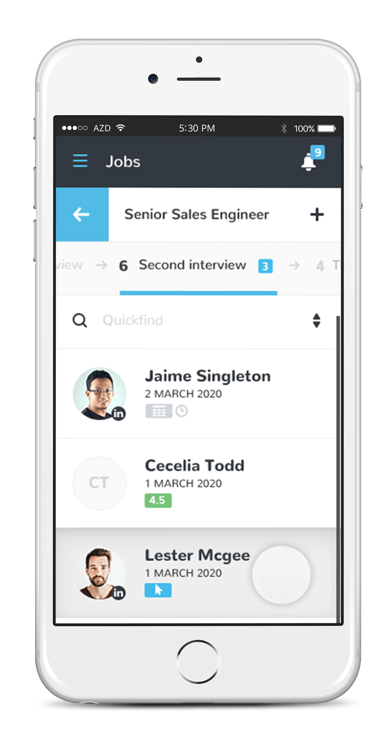
Evolve is a service software platform/digital portal designed to provide high quality automated executive search level service to the SME market. By adding digital tools to the recruitment process, the platform acts as a tool for candidates, corporations and interviewers to have a better recruitment journey.
Brand Identity
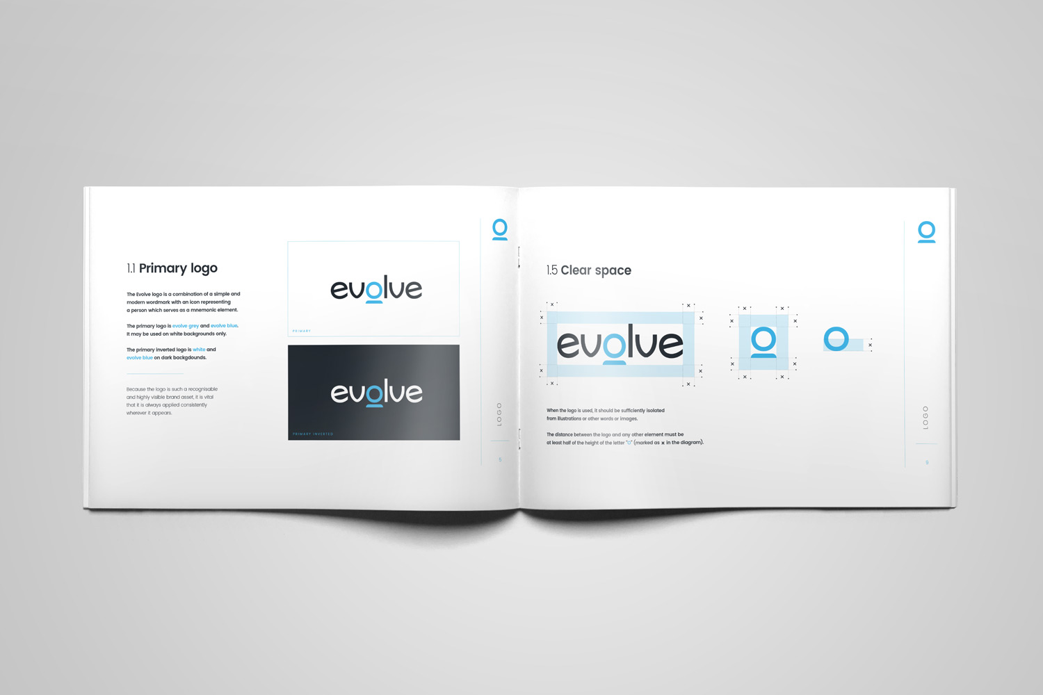
Choosing the right typeface as the basis for the logo design is a convenient starting point. The look and feel of the typeface “Sonika” was perfect for Evolve’s identity because of its modern, slightly techy and minimal appearance. The business is about finding the perfect person for the job which is why we put the human element in the middle of the logomark in combination with the letter “O”. The overall logomark is minimal in appearance, yet sends a clear message to the viewer and makes it easy to exploit possible visual ideas.
Colour Palette
The colour palette is designed to appeal to a more youthful audience and brims with professionalism, spontaneity, and modernity. The predominantly quiet colours like grey, black and white produce a subtle and classic look and feel. The sparing use of the lively blue results in a strong contrast which brilliantly complements the overall brand image and interface.
Evolve Blue
#44b5e5
Evolve Grey
#242a31
White
#ffffff
Black
#000000
Reinventing Recruitment
By adding digital tools to the recruitment process, the platform acts as a tool for candidates, corporations and interviewers to have a better recruitment journey.
Brand System
The Evolve brand system is inspired by the fundamental aspect of human connection and the innate desire to strive towards progress. At the heart of the logo lies a symbolic representation of the human touch, emphasizing the brand’s core belief in prioritizing people above all else.
This distinct visual element serves as a prominent feature across various modes of communication, effectively reinforcing the brand’s identity and solidifying its values.
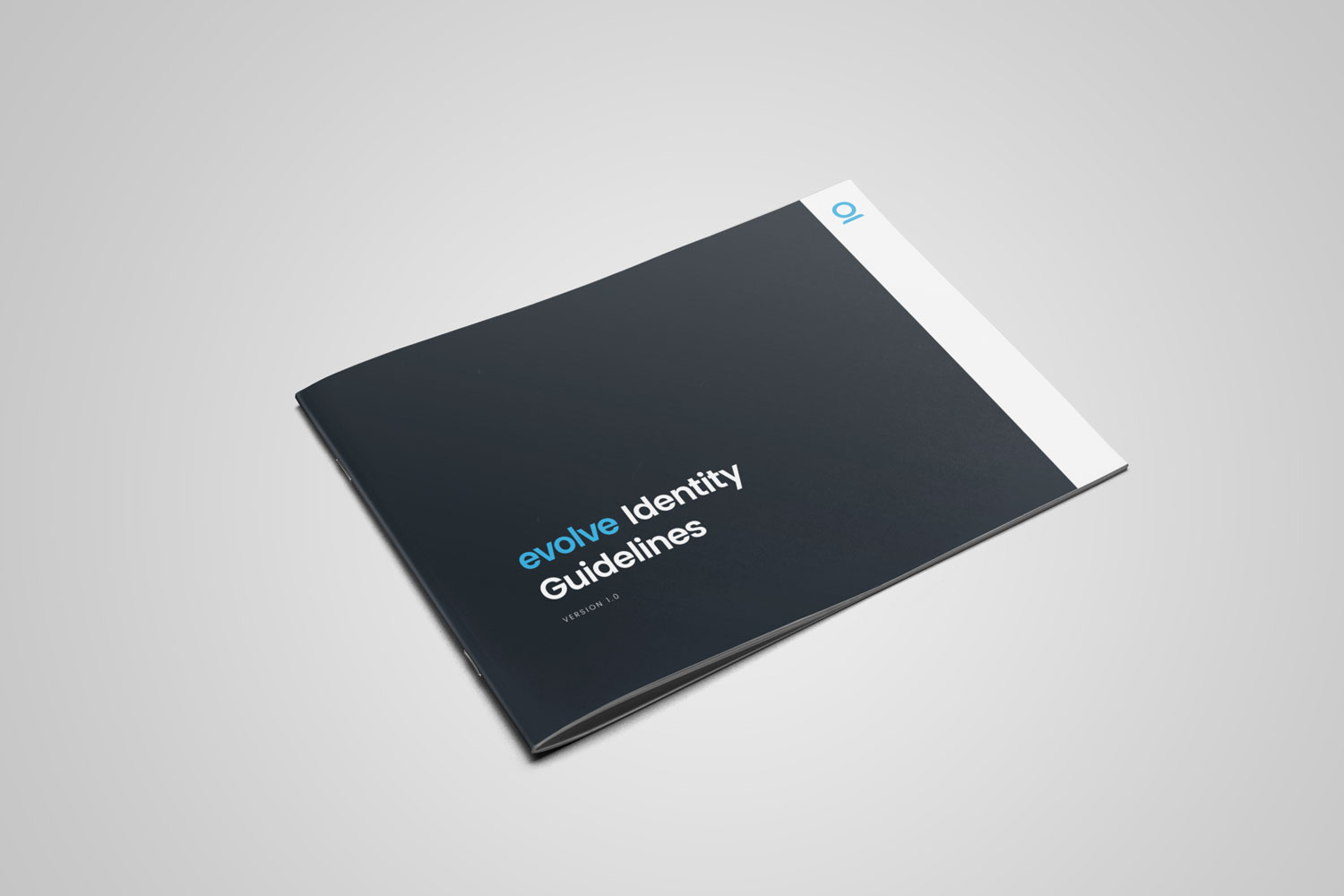
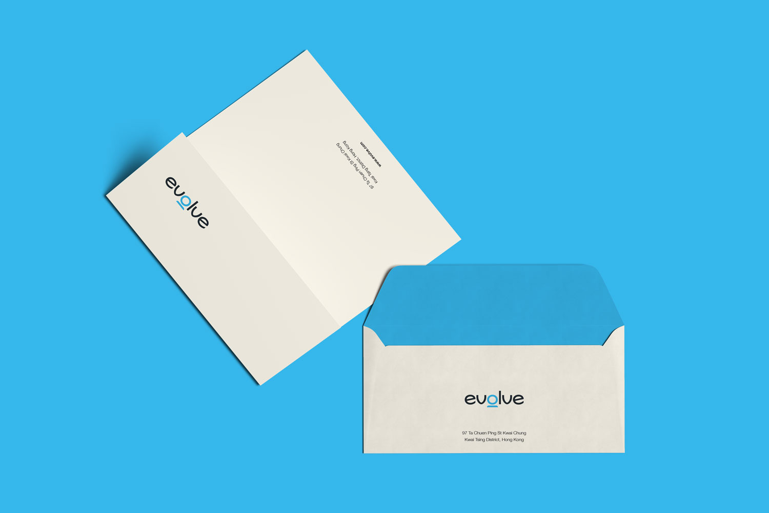
To uphold a cohesive and consistent brand image, we have developed a comprehensive set of brand guidelines. This encompasses guidelines on logo usage, colour schemes, typography, photography, event designs, print materials, and a range of other essential elements that contribute to the brand identity.
Mobile Responsiveness
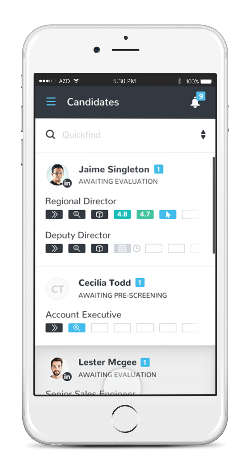
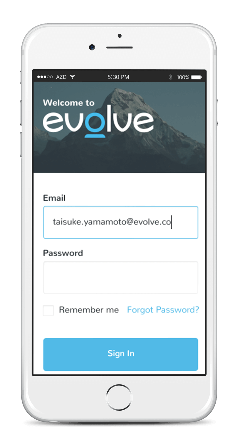
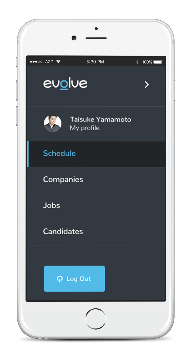
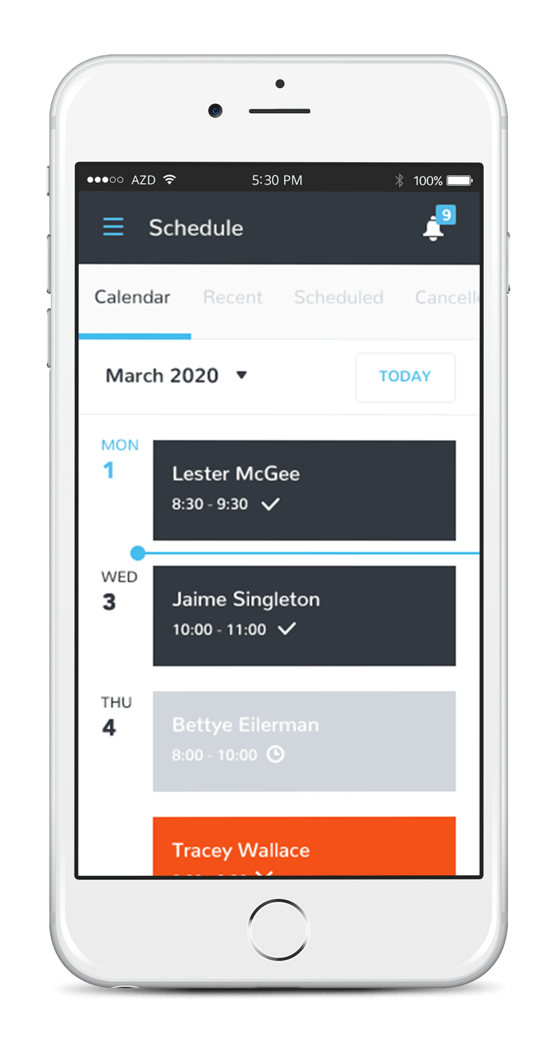
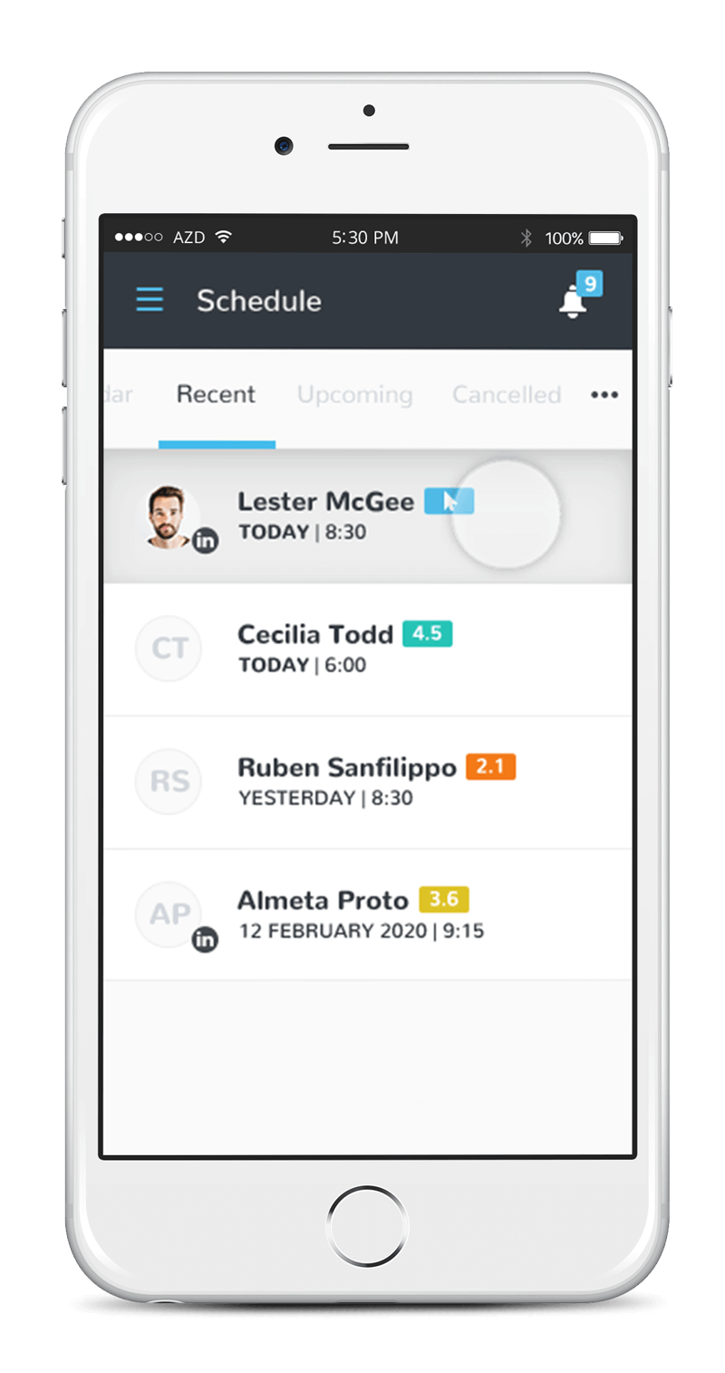
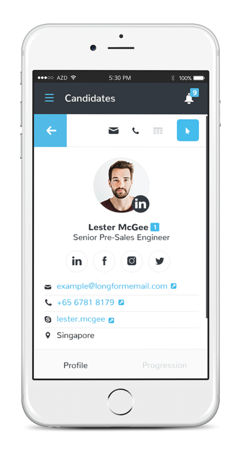
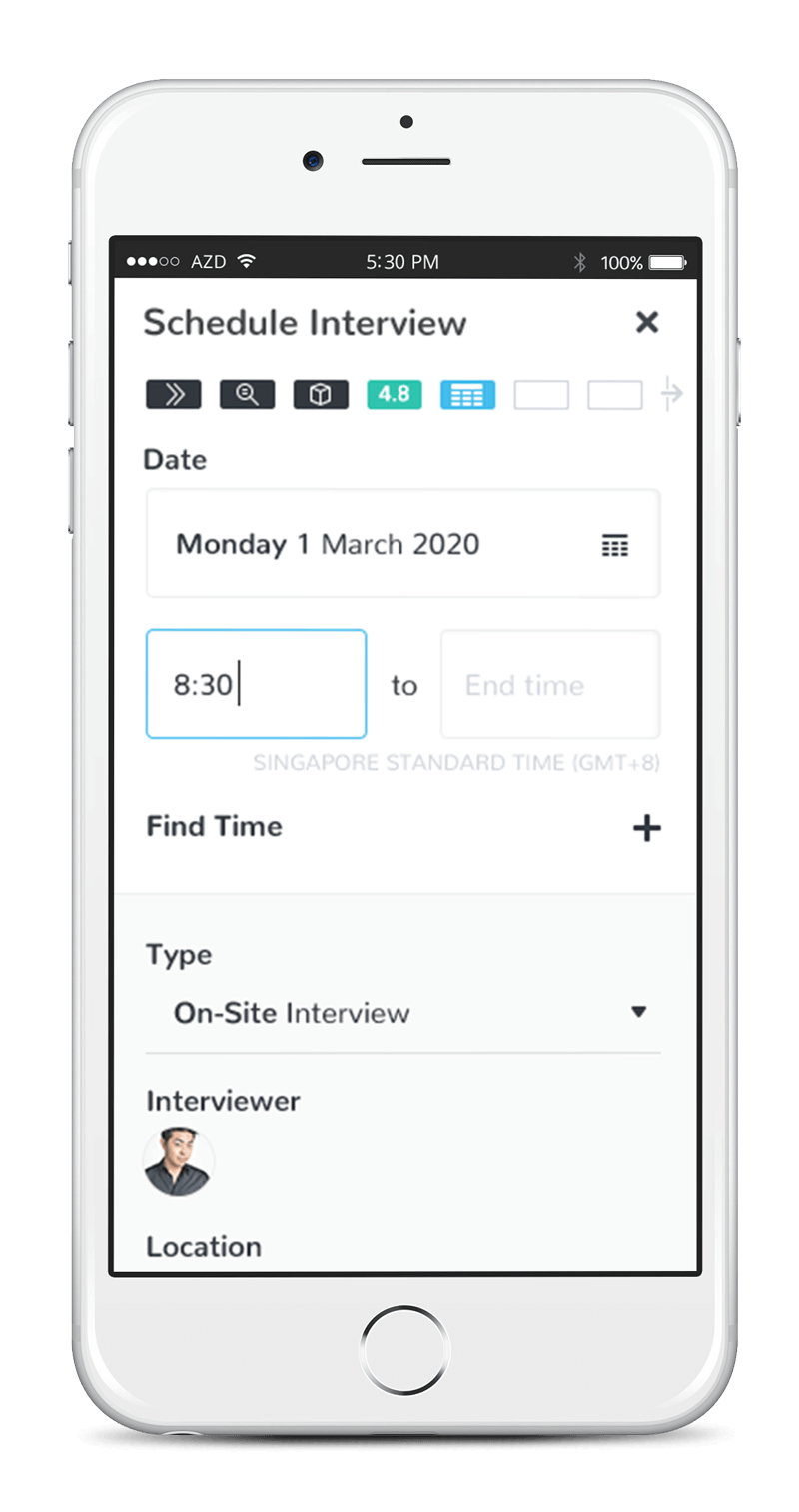
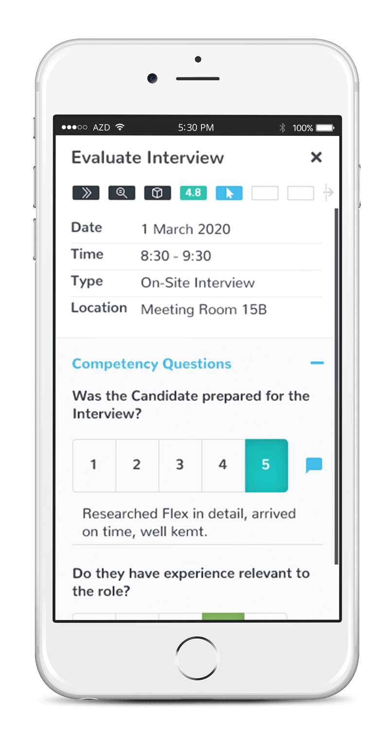
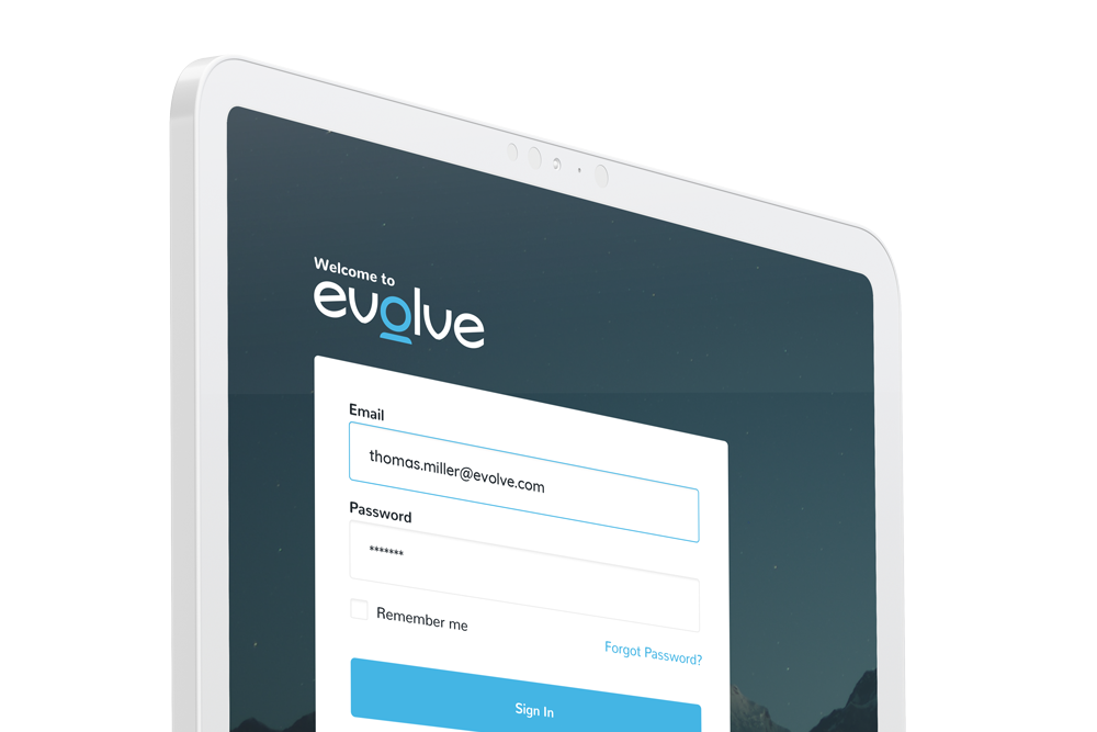
We have optimized our designs to ensure they display seamlessly across desktop, tablet, and mobile devices – elevating the user experience.


